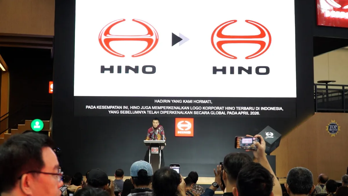
Hino Debuts New Visual Identity At GIIAS 2026
PT Hino Motors Sales Indonesia officially introduced its latest visual identity for the first time in the country during the GIIAS 2026 exhibition held at Hall 1 ICE BSD City.
Citing reports, this update serves as a key component of Hino's global transformation after parent company Hino Motors Ltd. launched the fresh corporate logo back in April 2026.
Based on reports, the commercial vehicle manufacturer integrated the new visual elements across its entire exhibition booth and communication materials to match modern global standards.
"Hino is not just presenting a new logo, but rather coming forward with a commitment to become a better business partner for customers," HMSI President Director Shingo Sakai stated regarding the transition.
Modern Logo Design Retains Deep Core Philosophy
The updated Hino logo features a streamlined and modern design optimized for seamless application across physical media and digital communication platforms alike.
Despite visual simplification, the company deliberately preserved the iconic letter H symbol that has represented its core identity since 1994 across generations.
According to company data, the redesigned logo incorporates symbols like a rising sun over the horizon to represent resilience, growth, and optimism in facing industry challenges.
Additional elements within the design emphasize environmental balance, technological progress, and safe operations across truck and bus transportation networks.
Exhibition Serves As Stage For Strategic Transformation
Choosing GIIAS 2026 as the launchpad provides Hino Indonesia with an ideal platform to demonstrate its corporate evolution directly to industry players and loyal customers.
With over four decades of operational history in the Indonesian market, the brand ensures that modern design updates do not eclipse its long-standing service values.
Based on reports, the company aims to strengthen its global brand consistency while honoring the foundational trust built with local businesses over the last forty years.
"Our new visual identity symbolizes that corporate transformation remains built upon the core values that established customer trust for over four decades in Indonesia," Shingo Sakai emphasized.
